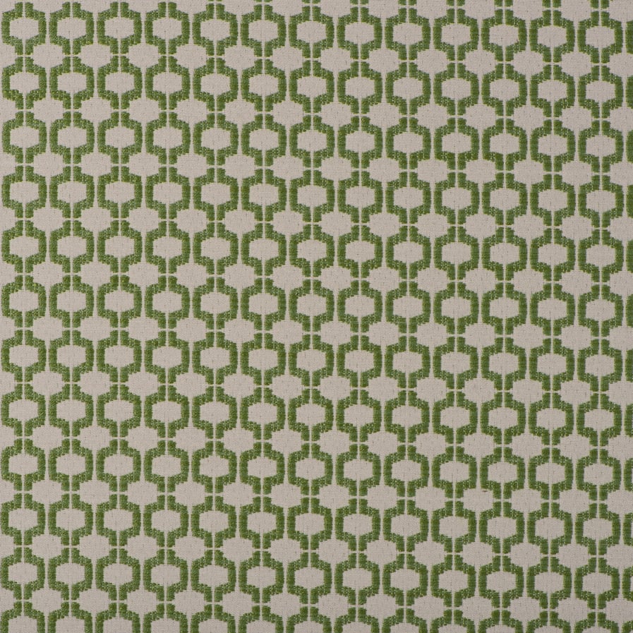
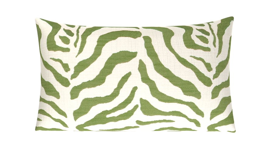
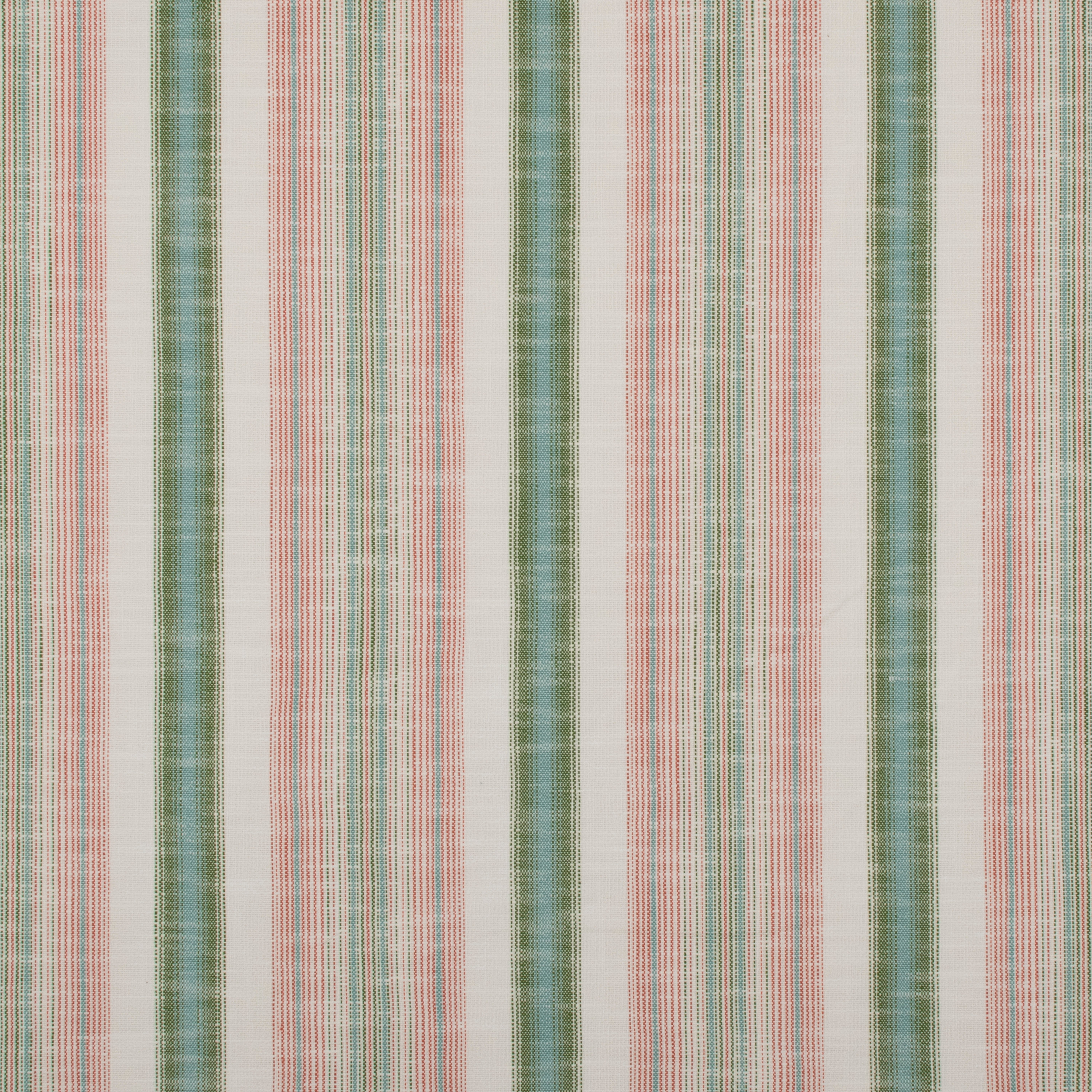
Great interior design is rooted in the study of psychology — how our surroundings make us feel and why. Color undoubtedly plays a vital role in this subject, and fern green — a soft and elegant verdant hue — is an exceptional study.
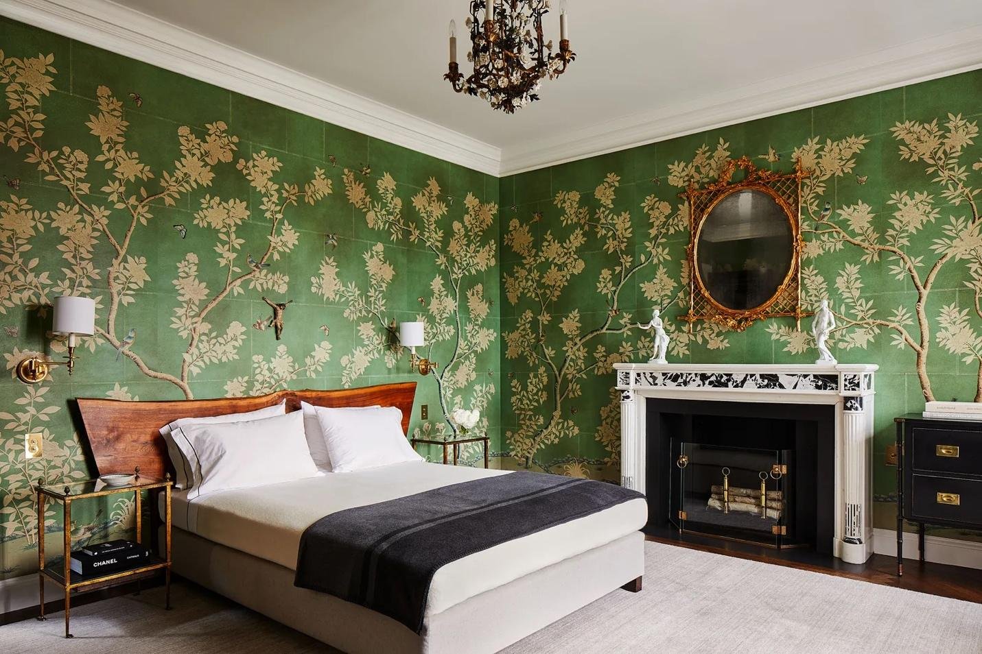
Image Source: David Kleinberg via Architectural Digest
Let’s dive into this mesmerizing color and how you can harness its vitality to transform your space.
Find Your Inspiration & Create A Mood Board
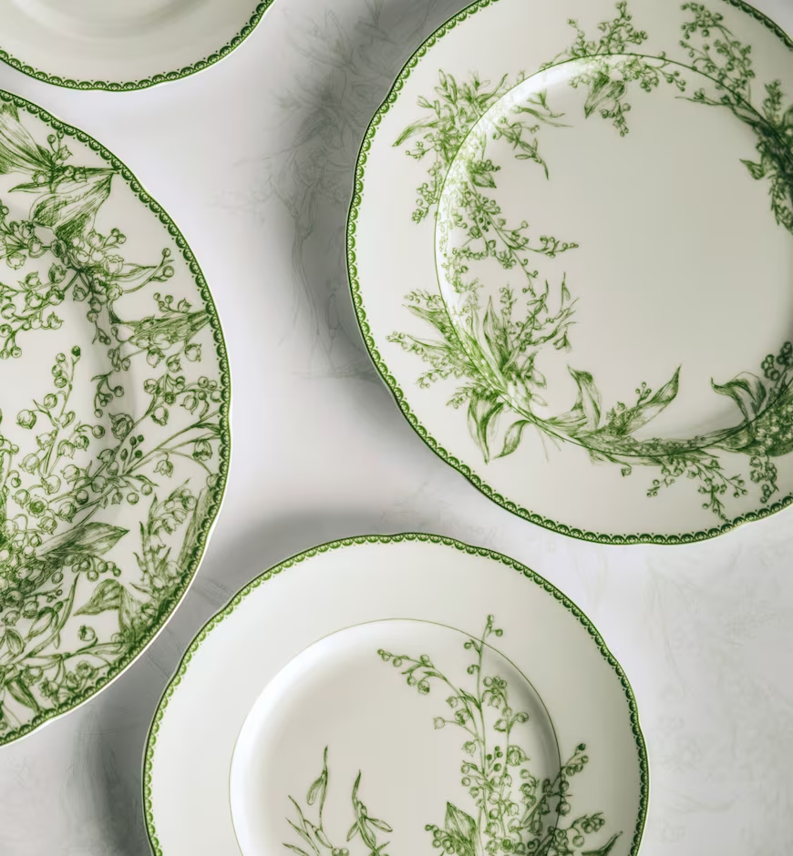
Image Source: Dior
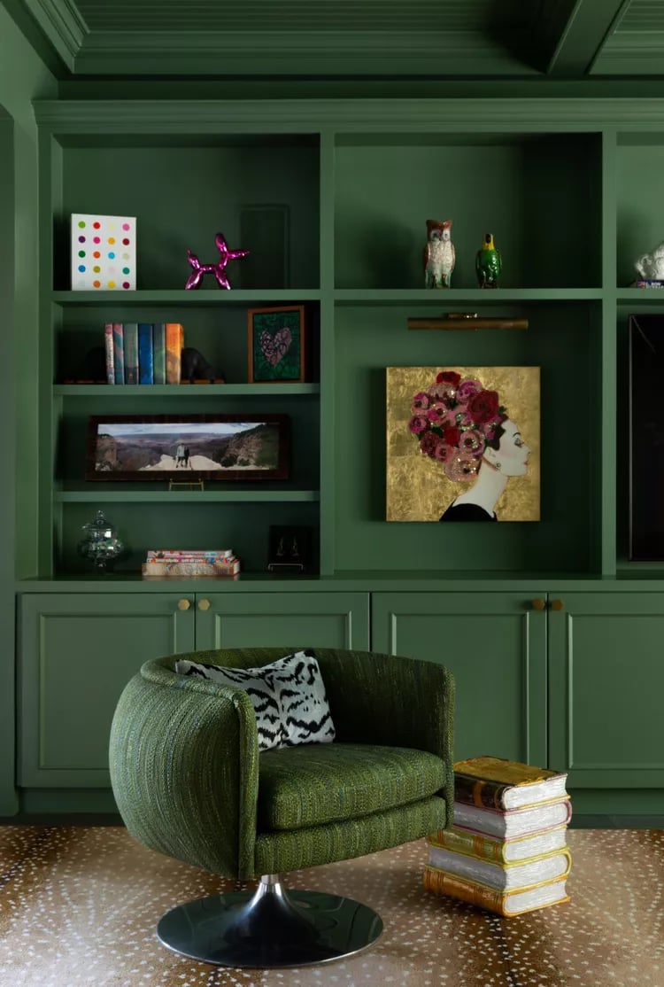
Interior Designer, Mary Patton, featuring Farrow & Ball’s Calke Green paint in this media Room
Before we begin a project, we love looking for inspiration all around us — starting with nature. The beauty of the natural world is readily apparent everywhere we turn, and often, we need only pause and take notice of our surroundings when searching for inspiration.
Be sure to utilize social media. Our Instagram and Pinterest are great starting points as we post design tips, tricks, and inspiration photos on the daily!
Next, create a physical mood board — one of our favorite steps in the creative process. There’s something powerful about visualizing design elements (textiles, sketches, photos, and finishes) to dream up your space, so don’t skip this important step.
Now decide how you plan to use the space and, most importantly, how you want the space to feel.
Choose Your Color Palette
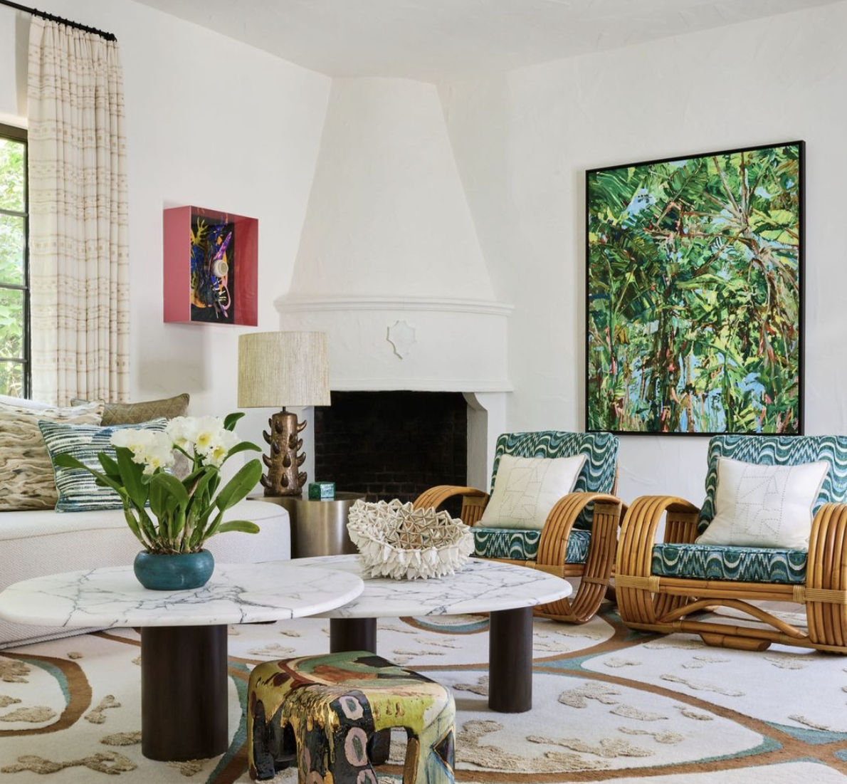
Image source: Elle Decor
Now that you’ve formed a plan for how you plan to use your space and how you want it to feel, it’s time to choose a cohesive color palette.
Start Small and Go Slow
If you’re unsure of committing to color in a larger space, use it as an accent for smaller spaces (powder rooms, bathrooms, or mudrooms are wonderful spaces for this) or as a pop of color on throw pillows, drapery, or art. Live with these small changes over time and add (or take away) as your inner designer guides you.
Don’t Be Shy — Go Bold
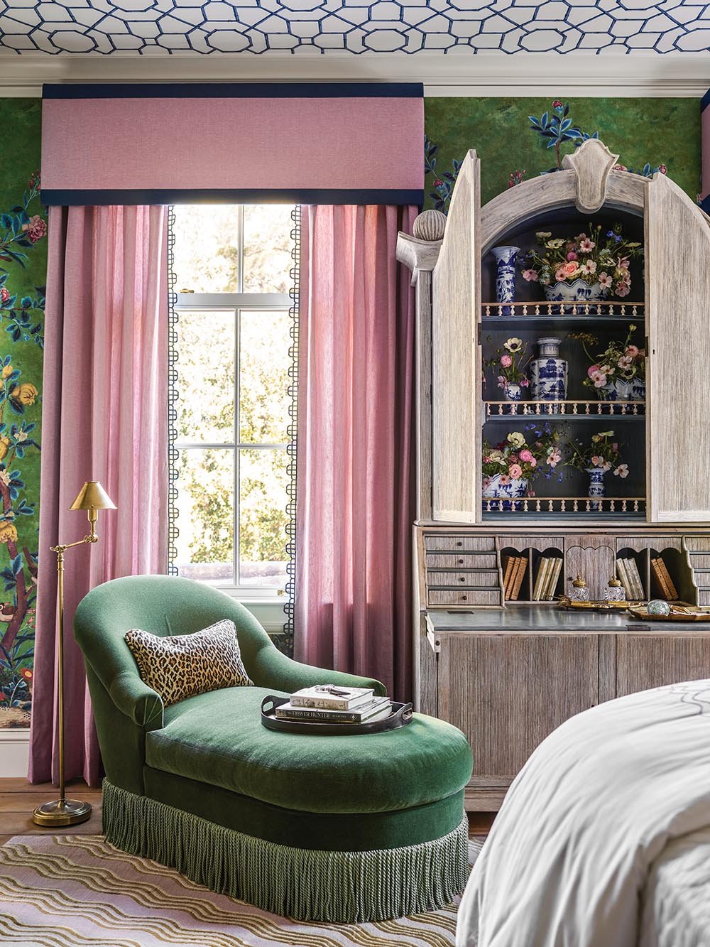
Bedroom design by Lisa Mende in Flower’s Atlanta showhouse. Photo by Emily Followill
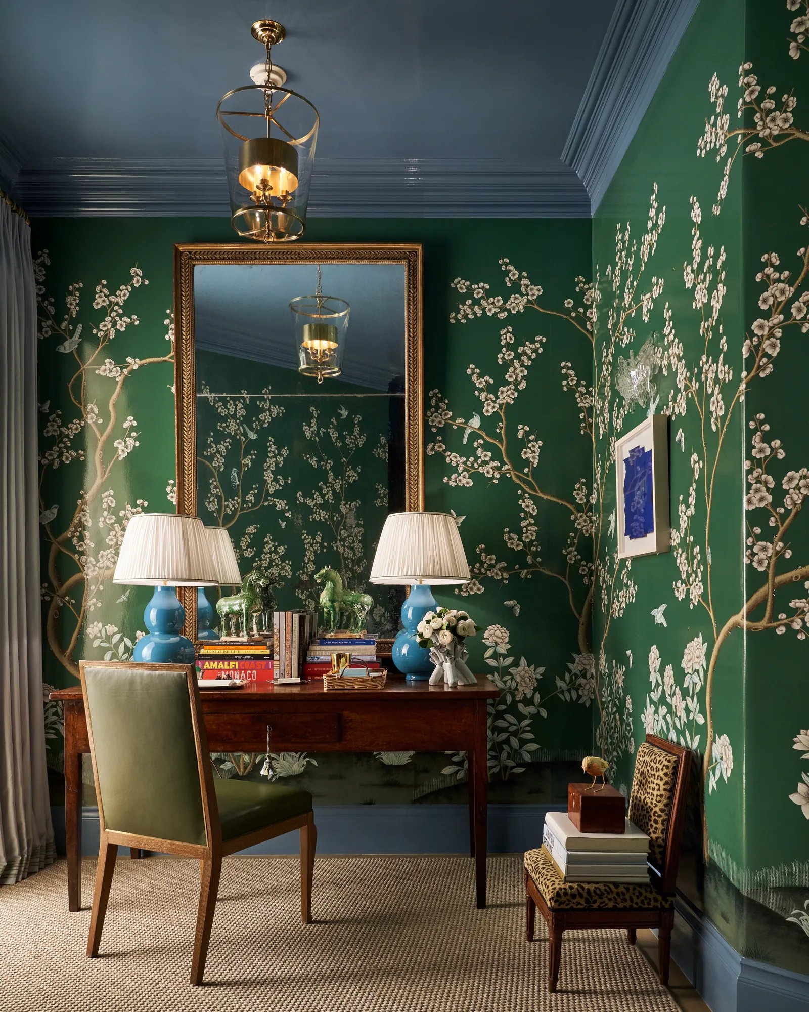
The Emerald Garden in Kips Bay Decorator Showhouse, by M Interiors. Photo: Stephen Karlisch
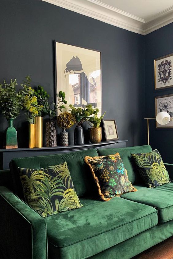
Image Source: Pinterest
MaterialWorks Windsor Billiard
While starting small might be best for some, don’t shy away from going bold if you feel called to embrace it. Wallpaper and big furniture pieces (think plush velvet sofas and chairs upholstered in a ditsy-inspired verdant floral fabric) are perfect ways to embrace color in an elegant yet powerful way.
Create Contrast Through Tonal Play
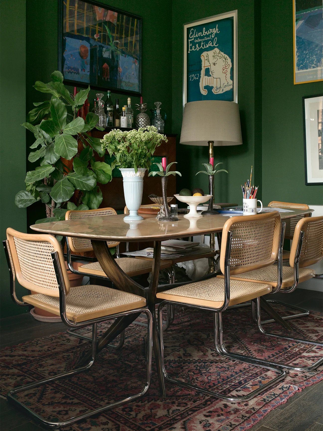
Interior Designer, Luke Edward Hall’s green and beige dining area in his London apartment.
Beautifully executed design has a mix of warm and cool tones together, and the balance (or imbalance) of these elements can completely throw off an otherwise beautifully curated space. As you solidify your color palette, be sure to thoughtfully incorporate a mix of both warmer and cooler tones — even within the same color family — for a visually cohesive space.
Keep tonal balance by adding warmth to rooms with a cooler color palette (wood tones, brass hardware finishes, and linen or leather accents work beautifully to give warmth to a space). Likewise, balance out any oversaturation of warmth by adding cooler elements to restore balance.
Put It All Together
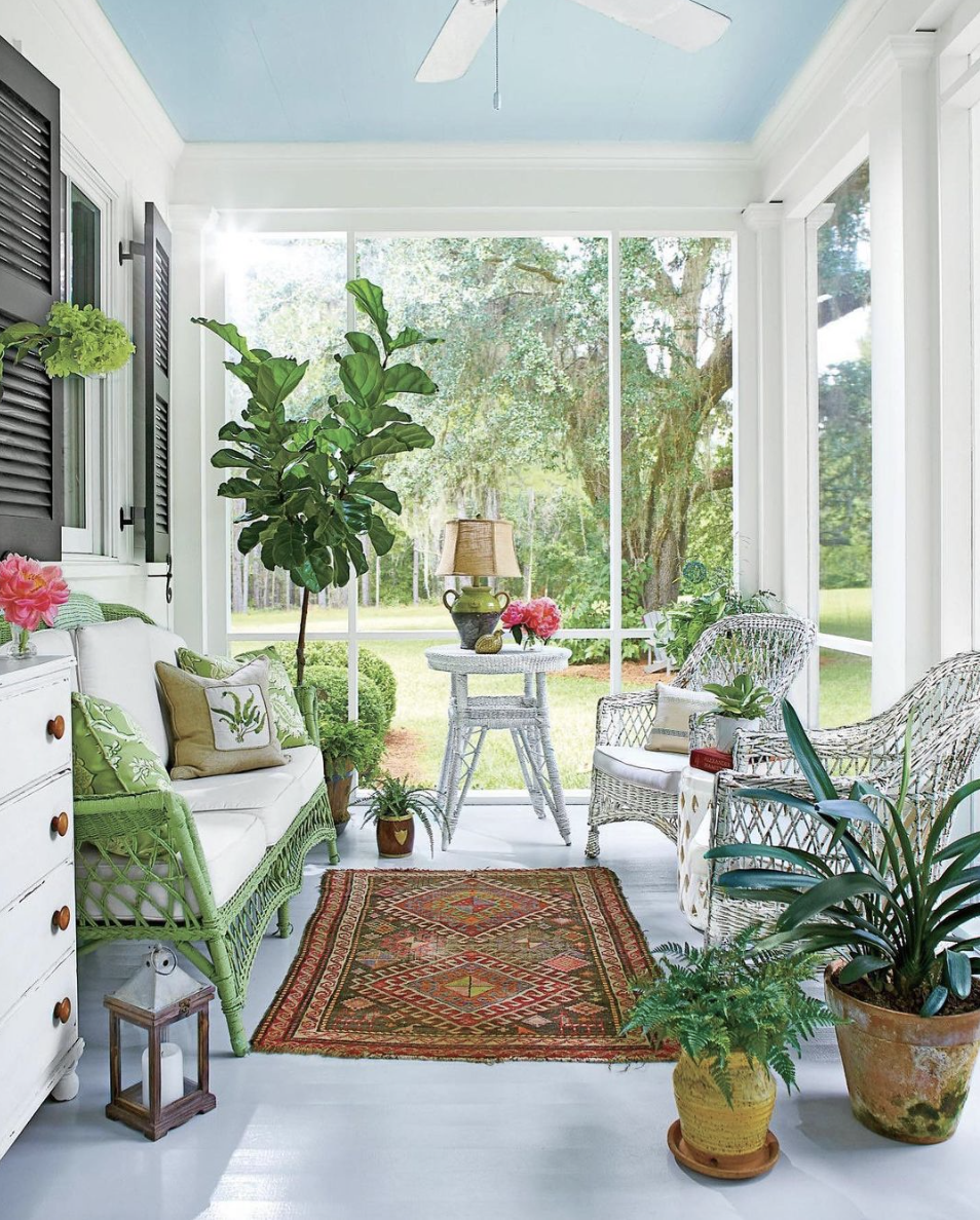
Image Source: Southern Living
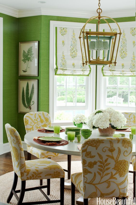
Breakfast room by Ashley Whittaker
Now it’s time to bring your inspiration and mood board to life — pull artwork, choose textiles, finalize your finishes, and implement your chosen color palette.
Sometimes you may need to adjust or recalibrate during this final process — and that’s okay. Always let your creativity and inner designer guide your process, and you’ll end up with a finished product that you love — every single time.
Now, add some plants and greenery for instant designer-worthy vibes.
Apr 4, 2023 3:30:50 PM
